Changers Hub
The rebrand
with the goal of strengthening Changers Hub’s identity and aligning it with their core values, I developed a rebrand and compiled it into a brand book with clear guidelines. This was also my thesis project, for which I received an award.

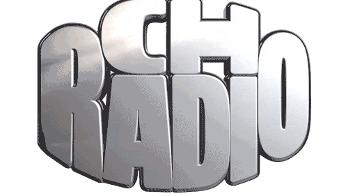
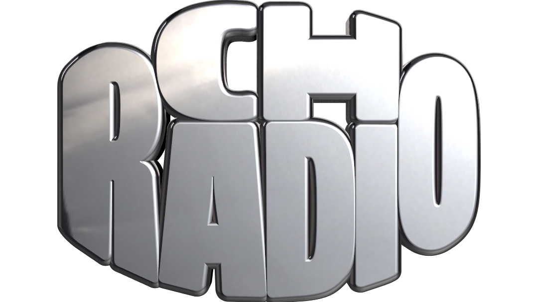
This isn’t just a flipped version of the old logo. It’s been redrawn with refined proportions, cleaner shapes, and a stronger structure that works across sizes and formats. The redesign respects the core of the original, keeping the same recognizable foundation to maintain familiarity and trust.
and with clear guidlines to accompany it
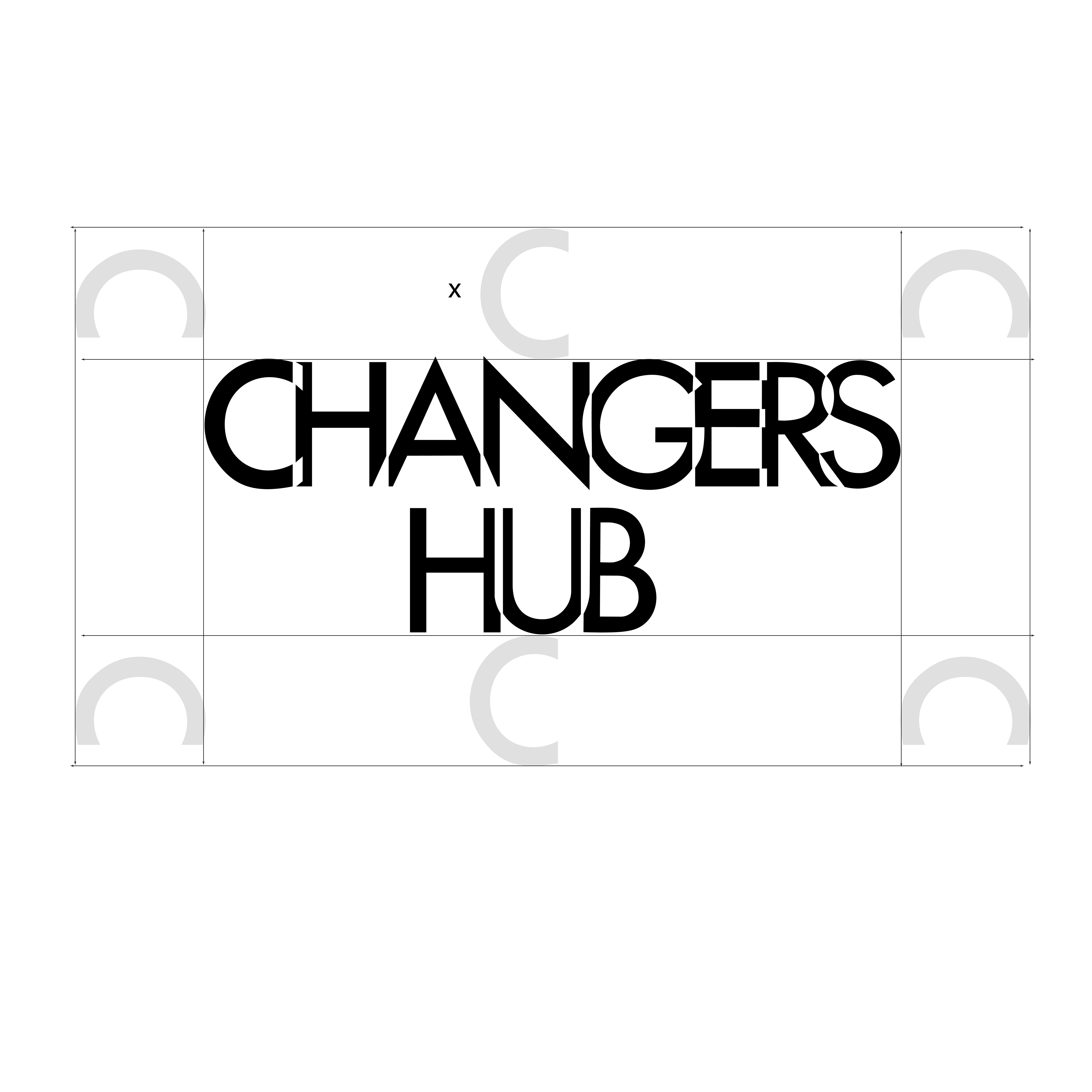
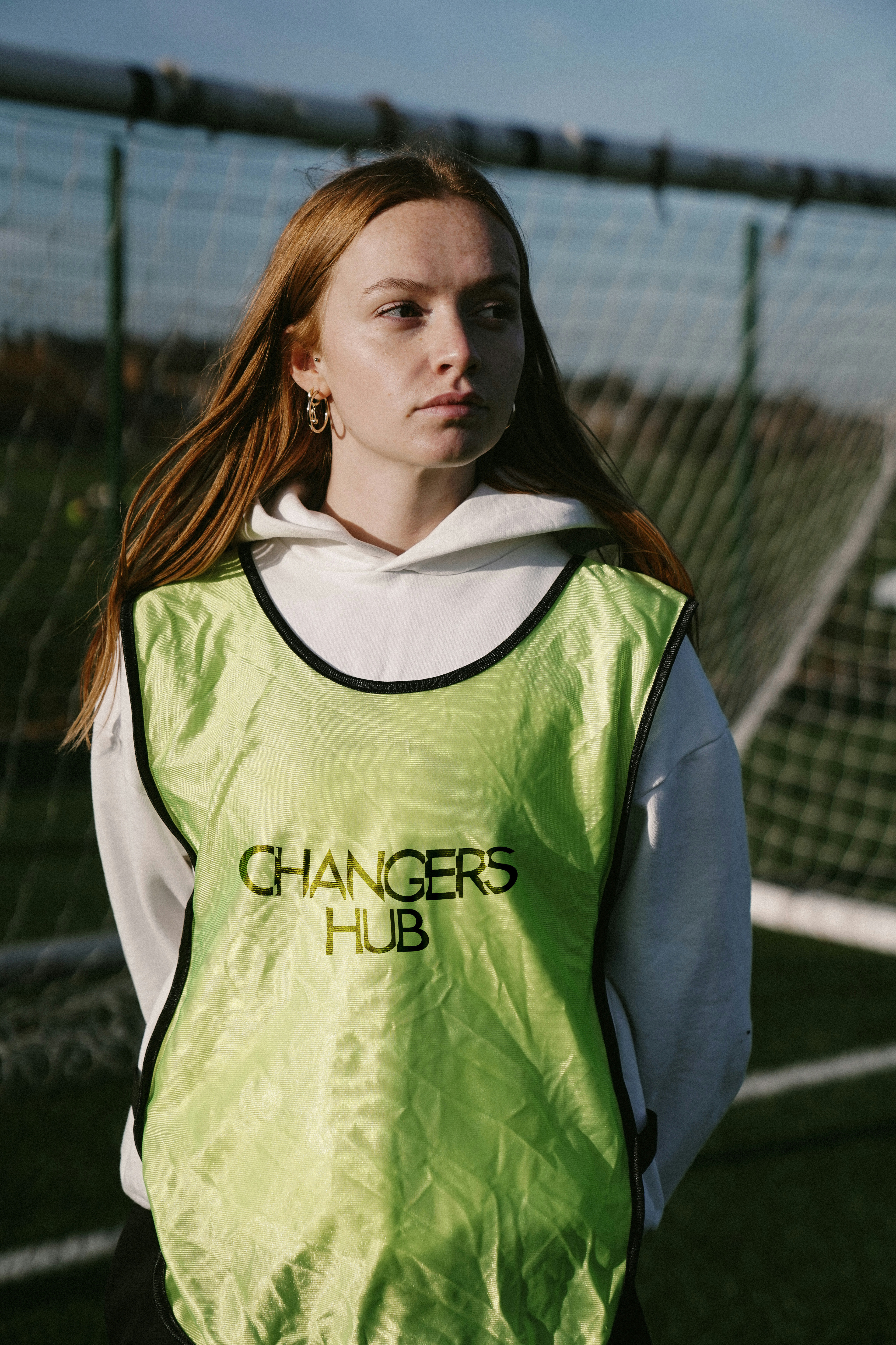
As well as the main logo there are also two logos made for smaller formats. The smaller ones are more adapted to profile pictures, favicons, merch and stickers.

the colors
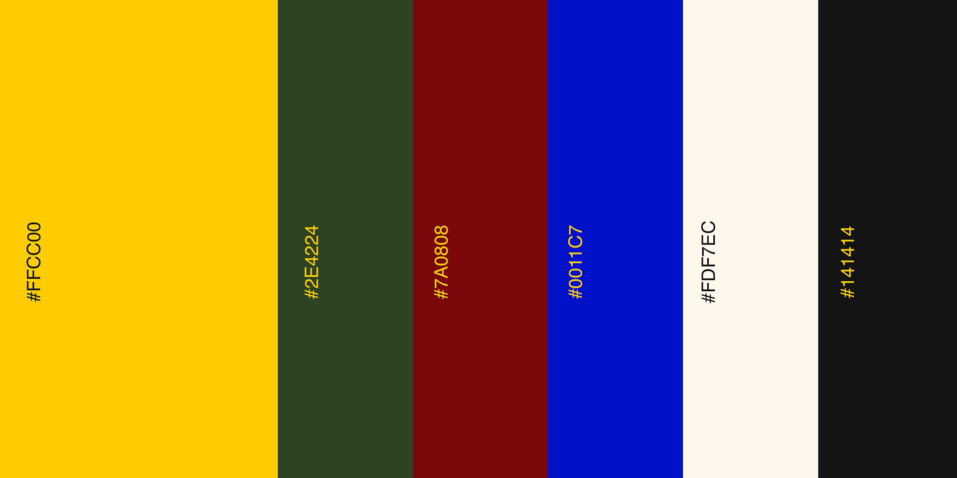
To complement Changers Hub’s signature yellow, I introduced a set of supporting colors that enhance its vibrancy without overpowering it. The added tones create harmony, flexibility, and ensure consistency across all brand touchpoints.
How to hustle
How to hustle is the brand book. Here is everything you need to know about changers hub.